Monday, October 18, 2010

New Logos and Changing the Labels: Why Companies Do Such Things

While I was thinking of something to write about, my boyfriend showed me the newest iTunes icon:


Credit to Apple

And I sat there and thought, "Why?"  The old icon was perfectly fine: why go and change their icon?

Credit to Apple


So then I also contemplated why certain companies have changed their looks multiple times over the years they've been in business.

Credit to Google Images and GAP


Credit to Google Images and Bath and Body Works


Credit to Google Images and Windows


So what is the logic behind the change in certain icons/logos/labels of products?
Times change: new generations are born every decade, now almost even less.  So I think that designers are trying to appeal to newer generations by modernizing their products and their logos.  Sometimes it's subtle: take the Bath and Body Works products, for example.  They have had several different designed labels, but I think designers in the company have decided that they needed to change the look of the products so that it doesn't necessarily show everything in that scent anymore.  In the Warm Vanilla Sugar old label, there was a picture of sugar cubes.  In the new label, it shows a vanilla-colored ribbon in the background instead.  Why change it so you can't see the products that it smells like?  I can't say for sure because I'm not the designer, but I think it's to make it simple for people and to make it so that they may be more intrigued to smell the fragrance instead of seeing the sugar cubes and saying, "Ew, no, I don't like sugary smells.  I automatically won't smell it."  They have also changed their bottle design during season changes: during the holiday season, they have snowflakes on their labels to give it a more festive feel.
For other companies, they have their reasons in the changing of their labels/logos/icons.  As I had said before, it's mostly about the times and the changing of the generations and what appeals to them.  I think that if a company lasts long enough, they should probably change their logos every once in a while so that they will have customers think that, "Oh wow!  They're hip and with it!"  It might boost sales with the new generation that sees the newer logo, but some of the public reacts badly. 
Take GAP's most recent example: after trying to change their look, they received a bunch of bad reviews from their audience.  They learned from this experience and kept their old logo.
Companies don't know whether it will compliment or condemn their companies if they change their logos: however, some companies have the money to pay designers to create their new logo.  Whether it's good or not, at least it gives designers an opportunity to give a company a new face.
Comparing and Contrasting Art and Design

When we ask people what art is, they have a general idea of what it is.  When we ask people what design is, the definition isn't as obvious to some.  But to those who do know what design and art are...  Well, it's not that easy giving straight definitions to distinguish the differences and similarities between the two.  My comparing and contrasting will be mostly my opinion of the definitions of art and design.
So what is art?  This question has been asked for centuries, but up to this day, it's still ambiguous in its definition. For me, art is (mostly) a visually appealing object in some form created by a (or several) person(s).


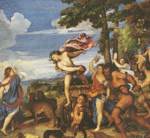
Dionysus and Ariadne by Tiziano


Psyche Revived by Cupid's Kiss by Canova


An unfinished sketch of my mother.  Credit to Alice White.


jasper-nance-high-speed-photography-5.jpg
High speed photography.  Google Images


The list continues, but those are just a few examples of what most people consider to be art.
In this way, it's similar to design just because the purpose of design is to make something visually appealing.
However, art is only an aesthetic that is used for decor or to make a point in our minds.  Design has a function: I see design as an artistic form of making something that may be drab and boring into something that is visually appealing to the human eye.  Design comes in many forms from designing the interior of a room to designing a website.  Although not entirely about certain aspects of art, design has its own category in making certain things more alluring to us.


Credit to Easylife Productions


Credit to ethicalweddings.com


Some see art and design as two completely different fields, some see them as practically the same.  I say they're both: design is a form of art, so it's not the same, but it also takes form from techniques that artists use in their works.  Art isn't always as functional as design, but some would argue that art is the reason why design exists.  So although they are different (but share some qualities), there will always be a debate as to their relation to each other.

Design as a Conversation... How about a Converse-nation?

A conversation, though simple, is something everyone does wherever they come from.  Whether it's through verbal words, actions, or even design, a point (or several points) is discussed during said conversations.  But exactly how are they related?
Take the company Converse, for example.  The ever so famous Chuck Taylors are still around and quite popular even amongst celebrities.


Jon Kopaloff/FilmMagic/Getty Images – J. Vespa/WireImage/Getty Images


I was a sales associate for the company for almost 2 years: although it's a personal connection, this is what helped me evolve from a quiet-ish person to someone who could strike up a conversation with just about anyone.
Chuck Taylors can also be a conversation starter.  The design of the styles on the canvas always tell a story whether the owner knows it or not.  The wide variety, if someone notices, can involve people and have them talk about the design of the shoes: from slip-ons to extra-highs, there is a variety of shapes, sizes, and even colored laces.


Google Images

Google Images


How does this relate to design as a conversation?  People may have conversations about the design of a shoe, but that's not the point.  Basically, your voice comes out in your design: your style defines your personality.  Through that design, the audience sees your work, and although they may or may not have a direct conversation with you, their reaction is their response to your voice/style.  So since your design can be your voice in a conversation with your audience, whether it's a client or your boss, it's always best to present your best voice, but to also make yourself stand out in the best way possible.  How else can you get your point across?

Monday, October 11, 2010

Faux Oil Painting/Hyper Realistic Acrylic Body Painting

Are you wondering what it is?  Well, here it is:


Credit to Peter Kun Frary


Credit to Alexa Meade


Credit to Alexa Meade


They all look like legitimate paintings, yes?


Well, they are...


Except not.


These are all real people who have been painted with acrylic body paint and have been incorporated with their backgrounds.  The irony in all this is that painters of centuries past have created paintings in order to make their piece of art as realistic as possible.  Now Alexa Meade, one of these artists, have taken real people and made them as unrealistic looking (painting-esque) as possible.


I find these to be truly amazing pieces of art, but how does design come into play?  Although I'm not a specialist quite yet, I know that there is a lot of design involved in how the background is set up, precisely how the people are painted, and where exactly they're placed in their specific background.
The first picture, by Frary, is actually all make up and was shot outside a MAC cosmetics store in Hawaii.  She was wearing very little clothing (a bikini) and managed to look like she was wearing a long sleeved shirt.  Impressive... but also most likely incredibly expensive to pull off (the fact that it's MAC cosmetics doesn't really help with the pricing).
The next 2 were done and photographed by Alexa Meade.  She has an entire gallery of people she had painted with acrylic body paint.  What is so amazing is not only the skill involved in making these people look like paintings even though they're three-dimensional; what is amazing is having them put all the pieces of this artistic puzzle together to create a piece of art out of reality that doesn't look like reality.  
As a bunch of jumbled nonsense as that sounds, it truly is something that we've never seen before and something I'd like to see more of in the future.  With artistic talent and an eye for the arts, the design involved is definitely important in giving the pieces their final structure and their final look.  I really hope we see more of this in the future and I really hope more people see it and appreciate it as the art it truly is.

Creativity from without... What is without?

How do you create something out of nothing?  Painters had oil, tempura, gouache and much more as media.  Sculptors had marble and other hard substances to create a life-like body or animal.  So how can modern designers find a way to make something visually pleasing to the human eye with none of those products?  As mind blowing as the concept is, I think designers have the ability to do what seems to be impossible.  It really seems to come with the job as it is.
As the saying goes: "One man's junk can be another man's treasure."  What may mean nothing to someone else may be the source of inspiration or direct use from a designer.

Credit to Mr. James Corbett... the amazing artist that created this and much more.

Now although this is a form of art through use of unusual objects, this also provides a visual of what is possible with something that seems absolutely useless: something that is useless in society is nonexistent, therefore it becomes nothing.  But once someone has found a use for something useless, it becomes something again.
What I think I'm trying to say is that lots of things, if disregarded, are considered useless and/or nothing.  But once they are given a form of usefulness or an appealing visual, it is given a reason to exist again.

Credit to Teracycle for making such cool backpacks!

A lot of thought processes must have gone through in order for these products to be made out of materials most consider to be trash.  There was probably a fair amount of designing going on to find the most efficient way to create such useful things.
Overall, "without" or "nothing" is just a phase for some things.  Some end up being nothing and will continue to be nothing for thousands of years to come.  But some are a little more fortunate in becoming something useful to humans in some form or another.  Designers may use materials to create and/or design, but nothing should definitely be another contender as another form of media.

Stone Soup: to see, not to taste

An incredibly successful collaboration of designers and their skills were definitely evident in class on Thursday when we worked together as a group to create something impressive with what supplies we had produced.  We started off a little unsure, but eventually, we practically threw all that we brought onto the table, studied them carefully, and began to plan by brainstorming ideas verbally.

About 1/3 of the supplies actually there

After lots of ideas, the 2 liter bottle became a tree trunk, brown paper became branches, and the box became the ground for the tree to take root in.  Pink colored paper became flowers, white paper became snow, and fishing wire became the air blowing the orange leaves falling from the tree.


Not every detail is obvious; however, it is supposed to be a tree representing 3 of the 4 seasons (flowers for spring, nothing for summer, leaves for autumn, and snow for winter).  The box has leaves to make it look more natural looking and a square hole on one side so you can see the roots underneath.  There were also a few other knick-knacks here and there.  One of our members created a nest with blue pins as eggs, half an egg carton as a nest, zebra-printed duct tape for a design on the nest, and other random natural things to put in the nest for the "eggs" to lay.  We also had a little squirrel hanging out inside the box with the roots.

=)

There are many other details as to how we created the "stone soup"; however, overall I feel that the main purpose of this project was to see how well a group of designers could work together and create something out of random objects.  I think we were successful in our endeavor: we all were involved in creating the project physically, but a good majority of us had an opportunity to have some form of input verbally as well.  We worked so well together and I can't wait to work with this group again.  We made a fantastic team and I know we'll have lots of new projects with our sweat, blood, and names all over them.

Monday, October 4, 2010

Designing Disneyland: Halloween style! =D

Because there wasn't much time left before school started, I decided to go to Disneyland during Halloween time.  Now, as we all know, Disneyland is one of the most magical theme parks in the world: a creation of the famous Walt Disney, "Disneyland will never be completed.  It will continue to grow as long as there is imagination left in the world."  Home of rides and attractions based on the many Disney animated (and a few live) motion picture films, Disneyland involves an incredible amount of cast members and imagineers who help keep the magic going.

For Halloween, there were multiple places in which they decked themselves out in Halloween decor.

Garden Display from the parking structure to Downtown Disney: on the tram

Goofy Jack O' Lantern at the gates

Window decor on Main Street

Speaking of window decorations, Disneyland's Main Street has stores in which every window has an intentional window display of their products.  Lots of work goes into these designs, but that will be another blog I will save for later...  I hope this intrigues you.  =)

Haunted Mansion: Nightmare Before Christmas Style!

Even the attractions themselves have become decked out in Halloween decorations... Or, in the Haunted Mansion's case, Halloween AND Christmas decorations.
Overall, I think the decorators had super amounts of fun giving Disneyland its annual costume.  With Jack O'Lanterns galore and characters dressed in costumes...
Actually can't tell who Mickey is supposed to be... any ideas, anyone?

This can all be considered just decoration, but I believe designers from all sorts of fields collaborate together to figure out the best ways to give Disneyland a Halloween vibe without under-doing it or overdoing it.  Landscape designers helped make the Mickey head of flowers by the entrance, but also included orange and purple flowers to make it seem more like Halloween.  Display designers helped design the window displays with Jack O'Lanterns and also stuck with the same color scheme of orange and purple (but added some green and black for some contrast and darkness).  Who helped created Goofy's Skeleton costume and Pluto's Vampire cape?  Someone had to make the sketches and make it a reality.
Design really is everywhere... even in the most magical place on earth.  I have a feeling that the constant changes in the multiple designs of this land of Disney will remain constantly changing.  I believe it will continue to inspire generations to always imagine and always be inspired to make the world a more beautiful place whether it's through magic or, in a designer's case, with a Prismacolor marker.

Happy (super early) Halloween!

*All photos credited to my fabulously weak Nikon camera and my super lame photography skills... and my boyfriend as well.  =)

Also, if you're interested, you should follow this link here and this link as well to find out about Halloween time in Disneyland and window displays on Main Street.

An Italian Life & Culture project: from obligation to inspiration

During my stay in Florence, Italy, I took several classes all in relation to Italian culture in some form.  One of them was called Italian Life & Culture: our midterm involved going to an assigned place, studying it, and bringing back its history.  When I realized my group's place would be a church, I initially thought, "Oh great.  Another church that's not the Duomo.  What other church in Florence can be as fantastic and awe-inspiring as the 4th largest church in the world?"

Basilica di Santa Maria del Fiore: otherwise known as the Duomo in Florence

When we walked to the Church of San Lorenzo and saw this:


I thought: "Oh man, this is not going to be fun."
But when we went inside...


...yeah.  Not what we expected, either.

Basically, this church had been created during the beginnings of Renaissance architecture.  What fascinated me the most was the difference between the outside and the inside: the outside had looked disintegrated and worn, but the inside nave was beautiful, detailed and awe-inspiring in general.  With a bunch of Corinthian columns and frescoes every direction you turn, it was quite a sight to see.  Although it is one of the largest churches in Florence, it felt much warmer and welcoming than the Duomo.  It's ironic, though: this church holds the cold bodies of the Medici family, yet I felt more welcome there than in the more tourist-y Duomo.

Although my emphasis isn't in interior architecture, I felt a connection with this place that hadn't resonated with any other place I had been in before.  I'm not particularly religious, so I don't think that had anything to do with why I felt so welcome.  However, after being in this church, I definitely will have certain expectations whenever I make my way to another similar church in age, structure, or place (being another church in Italy).  I know that this place will definitely influence the work I will do in the future: with the brightly colored frescoes, the high ceilings with detailed Medici emblems, and flawless sculptures, the Italian Renaissance has made a huge impact on what I may decide to use for certain projects in future works to come.