Haha, this blog hasn't been touched since I took Design 1 at UC Davis, which was fall quarter 2010.
I think I'll finally start trying to blog at least once a week. I'll look at Design tumblr posts I come upon and write about them. It should be good practice for me to write about design things that appeal to me while hopefully letting future employers read my voice. =)
Wednesday, November 9, 2011
Monday, November 29, 2010
Dangerous Design: Advertisement or Obituary?
There is a lot of controversy about what messages advertisements provide to the public. Designers have a strong role in advertising because they're the people that make sell the products through visual persuasion. Although this is very helpful and useful to companies that want their product sold, it can also be an incredibly dangerous position to be in: if designers are aware of all the pros and cons of what is being sold, do they go through with designing an advertisement that would persuade the public to purchase this product?
In the case of cigarettes in the 40s and 50s, there were advertisements that promoted the use of certain brands of cigarettes. Attractive people were used to gain the public's attention and to give them reasons to purchase their brand of cigarettes. "If you buy my brand, you'll look just as attractive as me!"
But one of the brands, Viceroys, had dentists on their advertisements to provide "a more legitimate reason" to buy their brand.

Credit to Google Images
Granted, they were not aware at the time that smoking was one of the causes of lung cancer, so they didn't realize that they were selling what some people now call "cancer sticks."
But this is a point that shows how unintentionally dangerous design could turn out to be. The people designing these ads weren't aware that the people they've convinced to buy these products may have ended up dying in the future from lung cancer. This is a social responsibility that modern cigarette advertisers take into account. However, we just don't know what we have now and if it will be something of potential future consequence. The fear that cell phones may cause brain cancer is something that we won't know until the future comes along, but for all we know, the current cell phone advertisers could be the next cigarette advertisers: promoters of future unnecessary death.

Credit to Google Images
We won't know for a while whether or not cell phones will cause early deaths, but what we do know is that advertisements are a designer's way to create something that may be important to society, but also may provide dire consequences in how people react to the product. It's a risk that they need to take in order to survive: survival of the fittest at its finest.
In the case of cigarettes in the 40s and 50s, there were advertisements that promoted the use of certain brands of cigarettes. Attractive people were used to gain the public's attention and to give them reasons to purchase their brand of cigarettes. "If you buy my brand, you'll look just as attractive as me!"
But one of the brands, Viceroys, had dentists on their advertisements to provide "a more legitimate reason" to buy their brand.
Credit to Google Images
Granted, they were not aware at the time that smoking was one of the causes of lung cancer, so they didn't realize that they were selling what some people now call "cancer sticks."
But this is a point that shows how unintentionally dangerous design could turn out to be. The people designing these ads weren't aware that the people they've convinced to buy these products may have ended up dying in the future from lung cancer. This is a social responsibility that modern cigarette advertisers take into account. However, we just don't know what we have now and if it will be something of potential future consequence. The fear that cell phones may cause brain cancer is something that we won't know until the future comes along, but for all we know, the current cell phone advertisers could be the next cigarette advertisers: promoters of future unnecessary death.
Credit to Google Images
We won't know for a while whether or not cell phones will cause early deaths, but what we do know is that advertisements are a designer's way to create something that may be important to society, but also may provide dire consequences in how people react to the product. It's a risk that they need to take in order to survive: survival of the fittest at its finest.
Utopian Design: Simply Forked
Design in society that is Utopian because it aims to improve society is universal because designers are (mostly) trying to create something that will help improve society. That way, their product will always be in demand. Even now, there are everyday objects that had to have been designed by someone to make life easier. Who would think to look in the kitchen drawers and look at our eating utensils?

Credit to Google Images
The fork has a long history in western culture and society. Though the idea of spearing our food has been around since the spear, we haven't had a set of prongs to use to stab our food until the 10th century. It had started to become popular in Italy and also became something of a delicacy over the years: only the rich had and used these utensils. Over the years, they've evolved in number of prongs, size, and shape. The curved shape we see today was developed in the 18th century by Germany. And in the 20th century, the spork was invented.
What many people don't realize is that the fork was designed in order to make eating food an easier task for humans. If it weren't for the invention of the fork, we may have only had spoons, knives, and chopsticks (though it's an interesting concept: would there have been other utensils created if the fork was never invented?). Therefore, the fork is a form of Utopian design in that it has provided a convenience for people and, in that way, has improved society.
Color Transformation: Designing with Different Colors
Most rooms begin with off-white walls and a bare floor, waiting for someone to move in and make the room a part of a home.

Credit to Google Images
Many people who move into their property end up deciding to paint the walls to give the room more personality. But the main question is this: what color should you paint the walls?
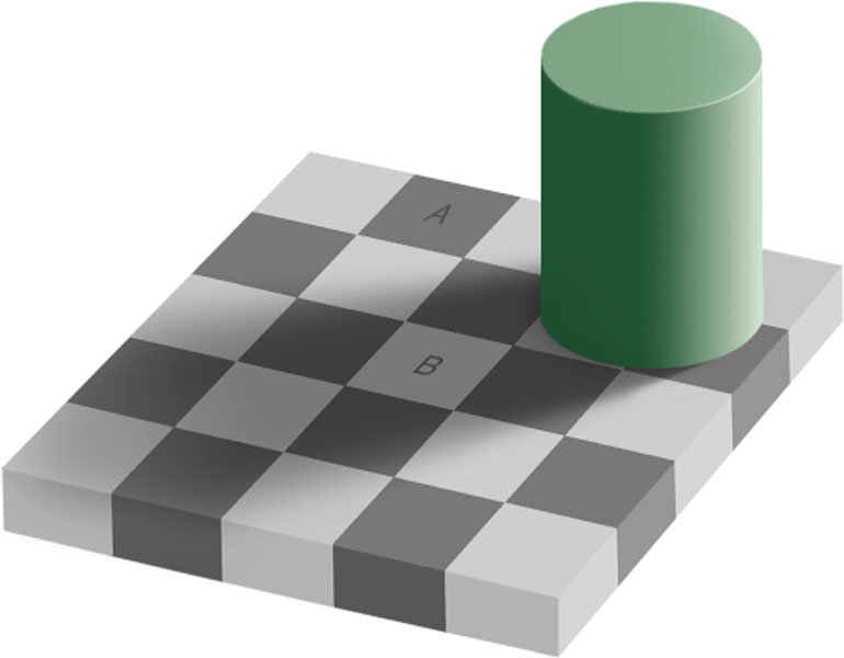
Choosing a color for a room dictates the feeling of the room. However, the right color choice is more important than some people think. According to Albers in Interaction of Color, "optical illusions... lead us to see and to read other colors than those with which we are confronted physically... the first exercise is to make one and the same color look different." (p.8)
Credit to Google Images
The picture above shows the optical illusion that square A is actually the same color as square B. Humans don't see that because those squares are surrounded by squares of either lighter or darker color, therefore we view them as different colors.
This also relates to the different shades and tints of certain colors. When someone asks you to think of Target red, everyone would come up with a different red because of how they view red.

Credit to Google Images
Which one is your Target red?
How does all this color theory relate to choosing the appropriate color for your room? The slightest color difference might not make as much of a difference to someone who doesn't have a really specific need, but certain colors will look different in certain rooms because of many reasons. What you thought was a lilac at Home Depot just might end up being lighter or darker in your room than you initially anticipated because of the lighting in your room as well as the flooring. So when you choose a color for your room, you should definitely choose carefully.
Credit to Google Images
Many people who move into their property end up deciding to paint the walls to give the room more personality. But the main question is this: what color should you paint the walls?
Choosing a color for a room dictates the feeling of the room. However, the right color choice is more important than some people think. According to Albers in Interaction of Color, "optical illusions... lead us to see and to read other colors than those with which we are confronted physically... the first exercise is to make one and the same color look different." (p.8)
Credit to Google Images
The picture above shows the optical illusion that square A is actually the same color as square B. Humans don't see that because those squares are surrounded by squares of either lighter or darker color, therefore we view them as different colors.
This also relates to the different shades and tints of certain colors. When someone asks you to think of Target red, everyone would come up with a different red because of how they view red.
Credit to Google Images
Which one is your Target red?
How does all this color theory relate to choosing the appropriate color for your room? The slightest color difference might not make as much of a difference to someone who doesn't have a really specific need, but certain colors will look different in certain rooms because of many reasons. What you thought was a lilac at Home Depot just might end up being lighter or darker in your room than you initially anticipated because of the lighting in your room as well as the flooring. So when you choose a color for your room, you should definitely choose carefully.
Monday, November 15, 2010
Here Comes the Bride: Serif or Sans Serif?
When someone receives an invitation to a wedding of close friends or family, their first impression of the budget of the wedding depends entirely on the cards that are sent in the mail.

Credit to Google Images
There is a lot that goes into designing wedding invitations: color themes, typefaces, and the artistry on the cover/envelope are all aspects in showing the personalities of the bride and groom while also (culturally) showing the possible budget of the wedding.
With it's involvement in the world of design, a designer has a huge job in creating a wedding invitation. Are the clients simple or extravagant? Are they simple black and white or do they have a color theme that involves purple, gold and green? And what about material of the invitations: more eco-friendly or the whiter the better? One of the more important of questions that designers would ask more so than their clients: are they looking more for Futura or Scriptina Pro?


Credit to Google Images
The design of the card is a way of the bride and groom communicating with their loved ones: this, of course, relates back to design as a conversation. This shows that design has its own way of showing its personality while also conveying certain messages. In this case, it shows a literal message of a happy union between two lovers. In this way, design has a strong form of communication: it is the voice of our loved ones in 2D.
Credit to Google Images
There is a lot that goes into designing wedding invitations: color themes, typefaces, and the artistry on the cover/envelope are all aspects in showing the personalities of the bride and groom while also (culturally) showing the possible budget of the wedding.
With it's involvement in the world of design, a designer has a huge job in creating a wedding invitation. Are the clients simple or extravagant? Are they simple black and white or do they have a color theme that involves purple, gold and green? And what about material of the invitations: more eco-friendly or the whiter the better? One of the more important of questions that designers would ask more so than their clients: are they looking more for Futura or Scriptina Pro?
Credit to Google Images
The design of the card is a way of the bride and groom communicating with their loved ones: this, of course, relates back to design as a conversation. This shows that design has its own way of showing its personality while also conveying certain messages. In this case, it shows a literal message of a happy union between two lovers. In this way, design has a strong form of communication: it is the voice of our loved ones in 2D.
The USB Thumb Drive/Flash Drive: A Successful Technological Design?
The modern world revolves around technology. Technology has gained so much momentum in its constant change in that if you take a computer class for one program one year, the next it will already be old technology. Let's go back to a time when computers are still somewhat new: what was the USB predecessor? The floppy disk. This was commonly used as portable ways to transmit information from one computer to another.

Credit to Google Images
Now, to do just that, we use the USB flash drive. The "thumb drive" first came out in 2000 and was manufactured by Trek Technology. Those flash drives started out at 8MB, 5 times the open space than in those of the floppy disks. Now, you can pick up a flash drive that has 4GB for only $15.
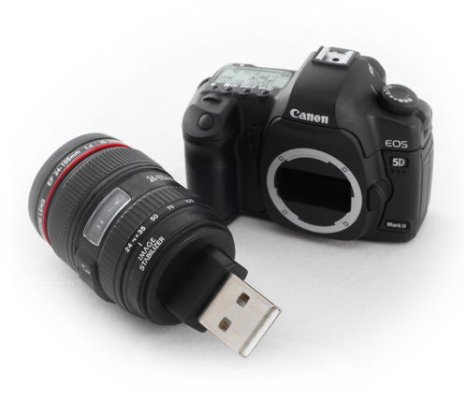
In fact, they've gotten even smaller. There is now what I've found to be one of the world's smallest flash drives.

Credit to Google Images

Credit to Google Images
So the design of these portable technological devices involve an incredible amount of technical knowledge that I don't have. However, I can view these through my designer eyes: what's involved in creating the aesthetics of this device to make it commercial?
In relation to it's functionality, the flash drive is smaller and easier to find room for than its predecessor. It can be plugged into a USB drive, which all modern computers have. Although most computers in the past had a floppy drive for the floppy disk, once information was on that floppy disk, you didn't have the option of taking it off. With the flash drive, you can put files on and off of it easily. Plus, unlike the floppy drive, it carries much more than the floppy drive ever could.
Reliability, on the other hand, is something of debate. Although it can last for a while, flash drives aren't made to last. According to Wikipedia, the memory or the connector of the flash drive will eventually fail. It's not to say that floppy drives didn't have their faults either, it's just that the flash drives can only take approximately 1500 connect/disconnect cycles. This means, of course, that there is room to improve this product.
How convenient the product can be used, or it's usability, is quite simple and doesn't involve breaking the product. The flash drive is inserted into the USB drive in the computer. Sometimes the connector comes out at the push of a button or the push of a small lever; others are just there ready to be inserted. As long as you know the basics of using a computer, it should be easy to put information on and off the flash drive. In this way, it's simple to use and reuse.
Proficiency for the flash drive doesn't require a lot of skill: as long as you're able to plug something into somewhere in which it looks that it should plug into, you're able to use it properly. And if you know the basics of computers, even better: you can put files on and off the flash drive. So the proficiency involved is very little unless you're technologically disabled.
Flash drives, unlike floppy disks, come in all shapes and sizes. In the creativity aspect that involves making them more personalized and, in this case, commercial and sellable, they come in all fun colors, forms, and materials.

All photos credit to Google Images
There are many more in the world of fun, cute, or just plain weird USB flash drives. I think they've proven themselves to be a profitable item in that they appeal to different people based on their personalities while also being something that people may need in order to transmit certain files to another computer. As a design, they're mostly successful: because they're easily functional and usable (though not entirely reliable), they are products that are meant for the world to think it needs. And who knows: they may have made their impact by being put on army swiss knives, but who will come up with the next fun exterior for these fashionable technological products?
Credit to Google Images
Now, to do just that, we use the USB flash drive. The "thumb drive" first came out in 2000 and was manufactured by Trek Technology. Those flash drives started out at 8MB, 5 times the open space than in those of the floppy disks. Now, you can pick up a flash drive that has 4GB for only $15.
In fact, they've gotten even smaller. There is now what I've found to be one of the world's smallest flash drives.
Credit to Google Images
Credit to Google Images
So the design of these portable technological devices involve an incredible amount of technical knowledge that I don't have. However, I can view these through my designer eyes: what's involved in creating the aesthetics of this device to make it commercial?
In relation to it's functionality, the flash drive is smaller and easier to find room for than its predecessor. It can be plugged into a USB drive, which all modern computers have. Although most computers in the past had a floppy drive for the floppy disk, once information was on that floppy disk, you didn't have the option of taking it off. With the flash drive, you can put files on and off of it easily. Plus, unlike the floppy drive, it carries much more than the floppy drive ever could.
Reliability, on the other hand, is something of debate. Although it can last for a while, flash drives aren't made to last. According to Wikipedia, the memory or the connector of the flash drive will eventually fail. It's not to say that floppy drives didn't have their faults either, it's just that the flash drives can only take approximately 1500 connect/disconnect cycles. This means, of course, that there is room to improve this product.
How convenient the product can be used, or it's usability, is quite simple and doesn't involve breaking the product. The flash drive is inserted into the USB drive in the computer. Sometimes the connector comes out at the push of a button or the push of a small lever; others are just there ready to be inserted. As long as you know the basics of using a computer, it should be easy to put information on and off the flash drive. In this way, it's simple to use and reuse.
Proficiency for the flash drive doesn't require a lot of skill: as long as you're able to plug something into somewhere in which it looks that it should plug into, you're able to use it properly. And if you know the basics of computers, even better: you can put files on and off the flash drive. So the proficiency involved is very little unless you're technologically disabled.
Flash drives, unlike floppy disks, come in all shapes and sizes. In the creativity aspect that involves making them more personalized and, in this case, commercial and sellable, they come in all fun colors, forms, and materials.
All photos credit to Google Images
There are many more in the world of fun, cute, or just plain weird USB flash drives. I think they've proven themselves to be a profitable item in that they appeal to different people based on their personalities while also being something that people may need in order to transmit certain files to another computer. As a design, they're mostly successful: because they're easily functional and usable (though not entirely reliable), they are products that are meant for the world to think it needs. And who knows: they may have made their impact by being put on army swiss knives, but who will come up with the next fun exterior for these fashionable technological products?
Monday, November 8, 2010
Make-Up and their Packaging: Designed to Re-Sell?
Many make up companies have limited editions of their products come out annually, bi-annually, or whenever they so choose. They also come out with certain lines within their brands that usually result in an increase in sales just because they have, for example, Hello Kitty's face on it.

Credit to MAC Cosmetics
Whether or not some of the colors may actually already exist with/without the Hello Kitty trademark on them, these products all sold very quickly. For Halloween, MAC also released a Disney Villain line.

Credit to MAC Cosmetics
I, myself, tried checking their website when I found out to see if they had anything left over. Just a week before Halloween, there were only about 2 products that weren't sold out. So is it that people buy products when they have a special line out even though the products themselves could be readily available in MAC's regular containers?
All make up companies spend a lot of time on making their products look sellable. But not every company creates lines that are limited editions. Regardless of whether the make up is temporary or will always be in stock, they all have certain designs to appeal to their audiences. MAC does a great job at selling their limited edition lines because they have characters on them that make the products incredibly sellable. Now, I'm not 100% sure about this, but I'm under the impression most of the products are new colors. However, I wouldn't be too surprised if I saw a color reappear with a Disney Villain on it to make it sell faster. I have no hard evidence of this, but I think it would be a well-worked process in order to sell something that wasn't initially selling.
Whether make up companies are selling limited edition lipsticks

Credit to MAC Cosmetics
or if another company is just trying to get themselves known, there is a lot involved in the design of how the packaging or the containers will sell the product.

Credit to Amy (Shrinkle)
This line of make up, Sugarpill, is a new line of make up that I discovered through a YouTube video within the past year. The reason why I bring this company up versus the long-living MAC is that its packaging and its containers are part of the reason why I picked them up in the first place. As a smaller company, Amy has spent a lot of time on making the packaging appealing to the consumers. I view this as a business owner trying to sell her product in the most appealing way. So if she starts a limited edition line, I believe a redesign of the containers would probably be the most effective way of selling the products: if there were only 100 of a certain item and you knew you wanted it, wouldn't you jump on that bandwagon right away?
Designing in make up is super important because most make up artists are also interested in what is visually interesting to them. So to make the best possible sell, a company must make their product seem valuable to their customers. Whether it's through visually appealing packaging or limited edition lines, design will always be integrated in trying to advertise to the public that, "This is the product you want."
"Hello Kitty Limited Edition."
"I'm colorful and exciting."
"I'm simple, but sophisticated."
What does your make up packaging say about you? The design of the packaging/advertisements say it for you.
Credit to MAC Cosmetics
Whether or not some of the colors may actually already exist with/without the Hello Kitty trademark on them, these products all sold very quickly. For Halloween, MAC also released a Disney Villain line.
Credit to MAC Cosmetics
I, myself, tried checking their website when I found out to see if they had anything left over. Just a week before Halloween, there were only about 2 products that weren't sold out. So is it that people buy products when they have a special line out even though the products themselves could be readily available in MAC's regular containers?
All make up companies spend a lot of time on making their products look sellable. But not every company creates lines that are limited editions. Regardless of whether the make up is temporary or will always be in stock, they all have certain designs to appeal to their audiences. MAC does a great job at selling their limited edition lines because they have characters on them that make the products incredibly sellable. Now, I'm not 100% sure about this, but I'm under the impression most of the products are new colors. However, I wouldn't be too surprised if I saw a color reappear with a Disney Villain on it to make it sell faster. I have no hard evidence of this, but I think it would be a well-worked process in order to sell something that wasn't initially selling.
Whether make up companies are selling limited edition lipsticks
Credit to MAC Cosmetics
or if another company is just trying to get themselves known, there is a lot involved in the design of how the packaging or the containers will sell the product.
Credit to Amy (Shrinkle)
This line of make up, Sugarpill, is a new line of make up that I discovered through a YouTube video within the past year. The reason why I bring this company up versus the long-living MAC is that its packaging and its containers are part of the reason why I picked them up in the first place. As a smaller company, Amy has spent a lot of time on making the packaging appealing to the consumers. I view this as a business owner trying to sell her product in the most appealing way. So if she starts a limited edition line, I believe a redesign of the containers would probably be the most effective way of selling the products: if there were only 100 of a certain item and you knew you wanted it, wouldn't you jump on that bandwagon right away?
Designing in make up is super important because most make up artists are also interested in what is visually interesting to them. So to make the best possible sell, a company must make their product seem valuable to their customers. Whether it's through visually appealing packaging or limited edition lines, design will always be integrated in trying to advertise to the public that, "This is the product you want."
"Hello Kitty Limited Edition."
"I'm colorful and exciting."
"I'm simple, but sophisticated."
What does your make up packaging say about you? The design of the packaging/advertisements say it for you.
Subscribe to:
Posts (Atom)